Data Visualization is inherently subjective. Different readers will experience a visualization very differently based on their aesthetic preferences, their background knowledge and prior experiences, and their reading situation, which can range from casual browsing to searching for specific information. Given these subjective factors that visualization authors have very limited agency over, how can we nevertheless create interactive charts and graphs that appeal to the intended audience and can be used in a variety of contexts to answer a broad range of questions?
In the last run of our semester-long Data Visualization course, this central question took the main stage. Over 110 students learned, discussed, and practiced tailoring visualizations to different audiences. To that end, the course introduced perceptual guidelines that hold true for all human readers and looked at exceptions to be considered when building visualizations for colorblind readers - or for the elderly. It showed how to assign colors semantically so that the chart becomes intuitive to a human reader, minimizing tedious lookups in a color legend that is placed somewhere at the margin. Special attention was given to user interaction by looking into different human time constraints – i.e., how long can it take for an interactive adjustment to a chart to take effect before starting to impede the user’s analysis flow and become bothersome?
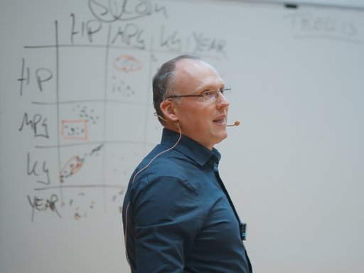
Associate professor Hans-Jörg Schulz who teaches the course elaborates: “Knowing about all these human-centered soft constraints is one important side of the coin. The other is how to fulfill them. And this is where hard computer science with clever algorithms and modern software architectures comes into play. For example, to undercut the approx. 100ms response time a human user expects when interacting directly with a chart requires cutting edge computational approaches like progressive visualization.” And this mix of human factors and modern computational solutions makes the course Data Visualization not only a popular choice among computer scientists and data scientists, but also for chemists, bioinformaticians, and business intelligence students.
In its quest for visualizations that incorporate the visual traditions and expectations of different readers, the course has for the first time also looked at cultural implications for creating charts and graphs. Some of these implications, like different reading directions, different levels of visual literacy, or different emotional connotations of colors are well-known. Yet, others are more subtle or more surprising. For example, in some cultures a sequential, linear idea of time is more prevalent, whereas in others, time is perceived more synchronous and cyclic. How well visualizations align with these mental models of the users significantly influences their ease of reading and recalling them.
To get a better understanding of this cultural dimension of data visualization, the course embarked on an experiment with a new teaching format and used international co-teaching to get some hands-on practice in cultural differences. Together with students from the National Technical University of Ukraine “Igor Sikorsky Kyiv Polytechnic Institute”, the course participants analyzed the different representational traditions in the Scandinavian culture vs. the Slavic culture. They then used their findings to style a visualization specifically for readers from one of these two cultures. This joint online activity was spread over 3 weeks and carried out in mixed groups consisting of both – Danish and Ukrainian students.
Given the current living and learning conditions in Ukraine, this activity did not come without hurdles, but it became a unique learning experience for all students involved. Philipp Haas, MSc student in Computer Science at Aarhus University, found the discussions with the Ukrainian students very enriching: “It was interesting to work with students who have a different way of thinking about the look and feel of charts, for example, being much less hesitant to use colors and pictograms. The number of Ukrainian students we spoke to was certainly too small to infer anything about the culture as a whole. Yet, it was still a good reminder that people from different backgrounds may have very different ideas and preferences as compared to what I as the creator of the visualization might favor.”
But the cultural exchange was not limited to the course contents. Philipp continues; “Even more than the joint visualization exercise, I really benefitted simply from getting a first-person account of what it means to live and learn under war conditions. Talking to the Ukrainian students, hearing their anecdotes, and apologizing for the noise of the air raid sirens in the background brought the war much closer than any news report ever could.”
Among the Ukrainian students, the cross-cultural visualization exercise was equally well-received. Professor Yuliana Lavrysh who lead the activity on the Ukrainian side observed: “Many of our students saw this activity as a chance to, at least virtually, visit a different university in a different country with a very different teaching and learning style – something that is unfortunately currently almost impossible in any other way. We received overwhelmingly positive feedback with many students thanking the teachers and students at Aarhus University for this opportunity.”
It is not everyday that one of our Computer Science courses is able to build bridges between countries and cultures. Associate professor Hans-Jörg Schulz remarks “It is exactly activities like this that prepare our students for a job market in which they are not only expected to bring coding and critical thinking skills, but also soft skills like navigating cultural diversity and working in hybrid and remote teams.”
In the end, it is thanks to our highly motivated students and their willingness to learn about a different culture and apply what they learned to their visualization projects, that made this unique activity such a success. If you are interested in joining the next run of our visualization course, you can do so either by signing up for the 3 week intensive summer course or by joining the next iteration of “Data Visualization” in the fall semester (not yet published in the AU course catalog - see 2023 here).

