Would you want to know how to predict certain diseases best? Or maybe rather which shoes to invest in when strategically building your sneaker portfolio? Or are you interested in finding out about the shipping routes of the transatlantic slave trade? None of these are computer science questions at first glance. Yet, computer science and in particular Data Visualization can greatly help in answering them.
This semester, the Computer Science Department at Aarhus University offered the Master-level course on Data Visualization for the first time. Data Visualization is the science and craft of showing large volumes of data graphically, creating highly specialized charts and diagrams for interactive visual data analysis and presentation. You could think of data visualization as picking up where the charting wizard of your spreadsheet software leaves off. It is the method of choice for any data that are too complex for the commonly offered bar charts, line charts, and pie charts.
“Data Visualization is unique in the sense that it is a perfect blend of soft and hard sciences” says Harshit Mahapatra, one of the more than 30 students who participated in the course this year. And indeed, building a data visualization requires many computationally and aesthetically complex steps to come together: from cleaning and preprocessing the data to designing and rendering the interactive graphics. In order to learn about all these different steps, the course is designed as a combination of lectures and project work that go hand in hand. This allows students to try out the concepts from the lectures in an actual visualization scenario and to learn from the feedback they receive along the way.
Assoc. Prof. Hans-Jörg Schulz, who runs the course, says “I was amazed by the broad range of datasets the students chose for their projects. And by the students’ creativity and programming skills in realizing their visualization ideas in code”. Indeed, the project results that come in the form of videos, interactive websites, code and data repositories show how much the students are invested in their visualizations. A selection of this year’s projects can be found at https://vis-au.github.io/#course-projects-2019
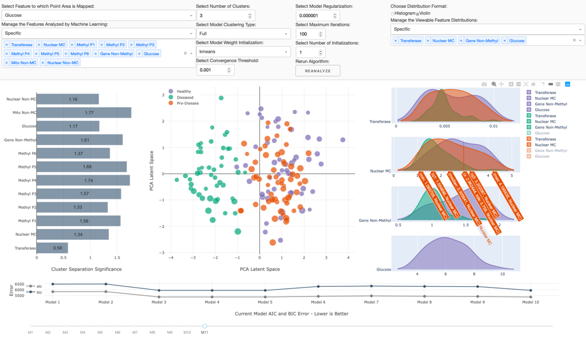
For example, there is Skyler Roth, an exchange student from West Virginia University, whose visualization solution helps to investigate machine learning results from patient data to identify certain disease predictors to be used in early diagnoses. And there is Casper Hogenboom, ERASMUS student from Maastricht University, who built visualizations to aid chart analysis for trading and investing in rare sport shoes. Another example is the one by Harshit Mahapatra, Tomas Mota, and Maximilian Scheid, who visualized a large dataset on the transatlantic slave trade to communicate its egregiousness down to the individual ship.
The Data Visualization course is particularly popular among exchange students, as for many it is a unique opportunity to gain insight into a scientific field that is not covered at their home universities. But it is not only the course contents that draw foreign CS students.
For many, the unique course structure with its diverse learning activities from weekly visualization tool tutorials to a hackathon on the last leg of the visualization project is a welcome change in their educational routine. “The course is demanding in every part and the expected level of professionalism in the visualization project is well above your average course hand-in” tells us Nils Simon, ERASMUS student from Goethe University in Frankfurt am Main. He adds “but the lecturer and the teaching assistants are always available to help with plenty of feedback and suggestions, pushing you to get the most out of the course and the project. Clearly the highest level of commitment I've seen in teaching in five years of university.”
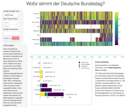
So, what did Nils get out of the visualization project? With Niklas Müller, Nils used the project to build a visualization tool for investigating the voting behavior of members of the German parliament. The tool makes it astonishingly easy to see periods of coalitions and oppositions among Germany political parties and to drill down further to see for which topics of legislature these overall patterns are broken. As Nils wants to use data visualization in his future job after completing his MSc in Germany, the project will be a cornerstone of his project portfolio when applying for positions.
These days, experts in Data Visualization are much sought after by companies in Denmark and abroad. Whether as data scientists, data visualization designers, data visualization engineers, or data journalists – data and the need for its graphical display have arrived in all areas of business. But also in the more mainstream computer science job profiles, knowledge of state-of-the-art visualization frameworks like d3.js, Plotly, or ggplot2 is often considered a strong advantage for an applicant.
The Data Visualization course runs every fall semester and is open to students with a CS background. Students from other fields need to be fluent in computer programming – preferably JavaScript and/or Python – to take the 10 ECTS course. Inquiries about course contents can be directed at Assoc. Prof. Hans-Jörg Schulz (hjschulz@cs.au.dk). Questions about course admission should be sent to our education advisors via ua@cs.au.dk.


