The need to gather, analyze, and ultimately understand data pervades all scientific fields. Hence, it is no wonder that the Data Visualization (DaVi) course attracts not only our own students, but students from all over the university – for example from the Faculty of Technical Sciences and the School of Business and Social Sciences. In the fall 2020, 40 students participated in the DaVi course to learn how to use interactive diagrams and charts to gain insight into data. During the course, the students realized their own visualization projects to put their newly gained theoretical knowledge into practice, and they built some remarkable interactive visualizations. Some of these projects are showcased at https://vis-au.github.io/student_projects/#course-projects.

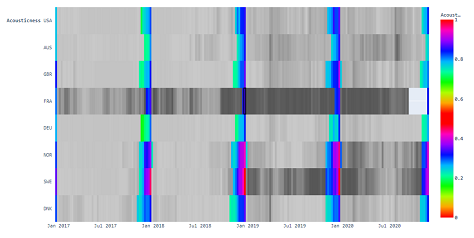
Together with Mathias Friis, Gustav used the visualization project to investigate musical trends from over 2.3 million top 200 songs from around the world. Their interactive visualization tool allows slicing and dicing the data by date, country, and various song properties. This led to a number of curious observations. For example, it turns out that the average length of a top 200 song in Japan is almost 1 minute longer than in Europe, or that Christmas season seems to start latest in France, if we assume the appearance of “Last Christmas” among top 200 songs is an indicator of that.

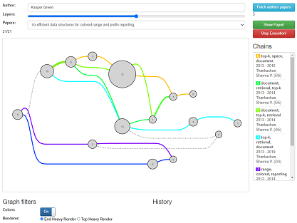
Being able to apply the learned visualization principles and practices in a concrete project is for many students one of the most exciting aspects of the DaVi course. Kasper Overgaard Mortensen remarked: “For a CS student, it is normally quite hard to show our family or friends what we do each semester. All you can present them is a black screen with some text on it, and tell them it took half a year to make. DaVi let me show something where the work that went into it is clearly visible and the usefulness is self-evident.” Together with Mathias Ravn Tversted and Kristoffer Strube Græm, he developed a web-based visualization tool for exploring and analyzing chains of citations in scholarly publications. This is done by extracting, fusing, and displaying data excerpts from DBLP - a computer science bibliography listing over five million publications and two million authors.
But DaVi is not only about creating visualizations, it is also about analyzing and critiquing existing charts and diagrams. Being able to critically read a visualization and to detect when it is meant to mislead the reader is a crucial skill in this age of fake news and native advertising. Assoc. Prof. Hans-Jörg Schulz, who teaches the DaVi course, puts much emphasis on this aspect in the course: “Data visualization is as much about algorithmics and computer graphics, as it is about developing a critical mindset with respect to graphical figures in general. Colors, axes, aspect ratios, or perspective can easily be chosen to use the readers’ visual perception against them and to make false trends and patterns appear. In the DaVi course, we teach students these pitfalls and we practice finding them in existing charts. And of course, the students learn best practices of visualization design to prevent these issues. Also, we discuss the ethical implications of misrepresenting data – be it on purpose or by accident.”
To Morten Visti Leal, business intelligence student from Aarhus BSS, this was actually the most important takeaway from the entire course: “The most useful thing I learned was how to criticize other visualizations. I find this very useful as it also helps me to see where my own visualizations are lacking something or may be misunderstood.” Coming from a very different academic background, Morten Visti Leal continues, “I have also learned a lot from taking a course among computer science students. I believe, this will benefit me in the future as the questions and concerns the CS students raised are very different from what I considered problematic. I appreciate this interdisciplinary a lot”.
This interaction between computer science students and students from all over the university makes DaVi a very special course in the CS curriculum. It hugely benefits from the variety of perspectives and expertise, fostering discussions and giving inspirations among the students. To many CS students, this comes as a surprising but welcome change of pace. Computer science student Kristoffer Strube Græm found that in DaVi the “TA classes are very different from other TA classes. They are actually more like a workshop or a seminar.” Interactivity is not only a crucial ingredient for data visualizations. It is also vital for the DaVi course where the students discuss each other’s work, and practice to base their discussions on the scientific guidelines of visualization research. This atmosphere of open yet grounded discussions is very characteristic for the course, as in data visualization there is rarely a single clear-cut solution to a problem, but rather multiple solutions with different pros and cons. Kristoffer Strube Græm concludes “DaVi really shows how student inclusion in the teaching process can be prosperous.”