A few weeks ago, another run of our master’s level course on Data Visualization came to an end. Nearly 90 students from 4 faculties and 8 different study programs used the course to learn about data visualization and to practice their visualization skills.
Data Visualization is the science and craft of turning data into interactive charts. As the Human-Computer Interaction pioneer Stuart Card once put it: “The purpose of information visualization is to amplify cognitive performance, not just to create interesting pictures. Information visualizations should do for the mind what automobiles do for the feet.” And building a good automobile – whether it is for the feet or for the mind – is not a simple task. In the case of visualization, it requires background knowledge on human perception and cognition, on color spaces and labeling techniques, on data cleaning and interaction methods, as well as practice in the design processes and software architectures tying all these facets together into a truthful and useful data visualization. The data visualization course provides students with this background knowledge and practice through lectures, practical TA sessions, and a visualization project that runs alongside the course. This project distills the theory on the subject into an interactive visualization to be presented at the end of the semester.
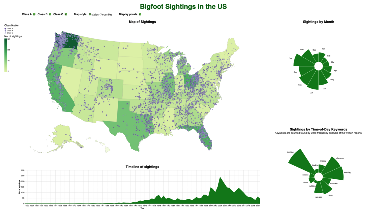
Many students remarked that they had experience with creating charts before the course. Yet for most students, it was the first time they really thought through all aspects of a visualization from which chart types to use - to where to place the tick marks on the axes, from how to wrangle the data to how to be inclusive of vision-impaired readers. Computer Science student Stinna Danger remarked “Previously, I would have just selected a chart type and been done with it, but we spent hours in the design phase and then additional hours talking about how it might have been the wrong choice after all and why.” Together with Johannes Ellemose, she built a visualization software for a dataset of Bigfoot sightings in the USA. The unique feature of their visualization is its cross-filtering capability. It allows readers to drill down into the vast amount of data by combining interactive selections across regions, time periods, seasons, and different times of the day.
One of Stinna’s main takeaways from the course was “that visualization can seem ‘fluffy’ from the outside, but the techniques are very concrete. It feels creative even though it’s quite logical.” This is indeed an aspect that surprised many students. ERASMUS exchange student Michael Allgaier from TU Munich who spent a semester abroad at the department mentioned that “a visualization may look remarkably simple and everyone has used visualization methods at some point. But on closer inspection, the area of data visualization is highly sophisticated and includes many pitfalls, numerous of which are discussed in the lecture’s visualization critiques.”
The practice of critiquing visualizations forms a central pillar of our Data Visualization course. It means to exercise one’s visual literacy skills to be able to critically analyze a chart. Is it expressive and shows the underlying data correctly, or does it mislead the reader? Is it effective and supports the reading task well, or does it make identifying and comparing values unnecessarily hard for the reader? Does the visualization report the data in an objective way that lets the readers draw their own conclusions from it, or is it slanted or biased in some way to nudge the reader towards a particular interpretation of the data? The importance of asking these critical questions is evident in the light of the misinformation, disinformation, and malinformation being part of our lives these days. For the same reason, many universities worldwide include lectures on responsible data science or data ethics in their study programs. While we may not be able to fact-check the data shown in a visualization, we can still do a plausibility check on the way in which it is shown, looking for the telltale signs of careless or even dishonest data representation.
Yet in our Data Visualization course, students do not only practice pinpointing what is potentially wrong or misleading in visualization examples given to them, but also on their own visualizations. A particular highlight is each year’s “Black Hat Visualization” session, where the students put themselves in the shoes of the adversary and try to create a visualization that convinces its readers of the exact opposite of what their data actually contains. One after the other, the students presented their purposefully misleading charts and all others had to debunk them. This fun exercise really sharpens one’s visual literacy skills by seeing all the possible ways in which the same dataset can be turned upside down. For some students it was also an eye-opener how hard it is to be an advocate of the data and only the data. Computer Science student Asger Ullersted Rasmussen found “that it is generally a lot simpler to mislead than it is to be truthful with your data. If you have a message that you want to push, it isn’t difficult to make the data look the part, but trying to be truthful and not mislead the user requires more thought and reflections about the decisions you make.”
At the end of the course, many students commented that they can no longer look at charts in newspapers, textbooks, or on Twitter without immediately deconstructing them. Stinna Danger commented “I have certainly become very conscious of the traps and pitfalls of plotting data that we were learning in the course when consuming media. Something we were taught that stuck out to me was how you can, without your visualization being bad or wrong, still push a certain message with a visualization. I think recognizing this is extremely helpful when reading political articles and commentaries.”
This is just one reason, why our Data Visualization course draws students from across Aarhus University and even beyond. ERASMUS student Michael Allgaier took the course, because “the Data Visualization course is highly praised and included as a ‘must-pick’ in many reports of previous exchange students – not only by students from TU Munich.”

