Computer scientists fuse and clean different data sources, train models, extract correlations, trends, clusters, and patterns. But often they are not the ones using these results. End-users, domain experts or people with background knowledge about the analyzed data get to interpret these results and base decisions on them. To make the results meaningful and useful for them, the computer scientists use data visualization to communicate and visualize the findings. Every year, the Department of Computer Science offers a dedicated course on data visualization where students learn the principles and even build their own data visualizations.
In September 2021, over 70 master and PhD students began immersing themselves into the world of data visualization. Four months later, they can look back on a comprehensive tour through this world. Starting from the basics of colors and chart types, moving all the way to advanced topics like visualization requirements engineering and how to make visualizations interactive and explorable. During the practical exercises, they practiced how to critically analyze existing visualizations as well as interacting with clients in need of data visualization. Guest lectures by successful data visualization start-up founders and software engineers who build data visualizations for a living rounded off the program.
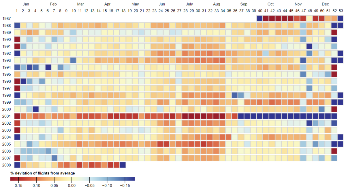
“This was the most interactive and engaging course I've taken at AU” commented course participant Adam Petro, and fellow student Harith Rathish added “the visualization course gives the end-user's perspective more priority than other courses I've taken. The course is very practical and the course project, the project presentations, and the project hackathon are a great way for us to put to our learning into practice.” Together with Nishka Dasgupta and Vidur Singh, Harith used the course project to build a visual analysis platform for tracking trends in the number of US domestic flights over a 20-year period. The more than 11 GigaBytes of data had many unanticipated challenges in store. At the end of this semester, they not only became visualization experts, but also know everything about normalizing timestamps across different time zones and adjusting for daylight savings time to ensure consistent and accurate visualizations.
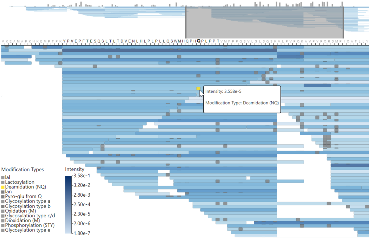
Some course projects even took up the challenge of working with end-users and built visualizations for them. For example, Christian Leth-Espensen, Sebastian Loeschcke, and Oscar Orellana developed a visualization system for scientists from Aarhus University’s Department of Food Science to interactively analyze results from mass spectrometry experiments. Every week, they sat down with Assist. Prof. Søren Drud-Heydary Nielsen from the Center of Innovative Food Research (CiFood) and iteratively built and refined a visualization system that shows modification of peptides identified by the mass spectrometer.
Christian, Sebastian, and Oscar invested a lot of extra time wrapping their heads around the domain problem and what the 7 GigaBytes of of data meant, which they got for every analyzed sample. Once it was clear what the visualization needed to show, and what the food scientists wanted to do with it, they applied their newly gained visualization skills to the data. As Sebastian Loeschcke put it: “This is when the real work began, putting together everything we learned about human perception, design principles, and how to implement efficient algorithms”.
The outcome of their project has been well-received among the food scientists and has already been showcased in presentations for academic and industrial audiences. Assist. Prof. Nielsen concludes that “with the developed visualization prototype, we were already able to observe a number of curious anomalies in our data that we otherwise wouldn’t even have thought to look for. This is a very promising steppingstone for our research. In collaboration with the Computer Science Department, we are keen to further develop the visualization software.”
Such a deep dive into building data visualizations for end-users is not a given for any computer science curriculum. Luis Rodriguez Rubio, who came to Aarhus to do his master in Computer Science, says; “data visualization was something that has not even been mentioned in any of my courses back in Madrid.” He was excited to learn that here in Aarhus he could study “a field that is so different from the typical algorithms or complexity class.”
Many students use this course as an opportunity to add data visualization as a unique skillset to their portfolio. Assoc. Prof. Hans-Jörg Schulz, who teaches the course, finds that “data visualization skills are much sought after in industry, but often really hard to come by.”
He believes the multidisciplinary nature of the subject to be the reason why dedicated data visualization courses are not commonplace at all computer science departments. After all, data visualization draws on computer graphics, data science, graphic design, interaction design, and cognitive psychology, as much as it draws on algorithms and data structures. “It’s certainly necessary to understand the algorithms when developing a visualization. But one must also keep an eye on all the other aspects – like dealing with missing or contradicting data entries, placing legends and labels, and assigning colors while minding readers with impaired vision. To find all this bundled together in one is what brings students to this course. And some it even brings to Aarhus,” Hans-Jörg concludes.

